A Data Analytics Enthusiast

Simplifying the world,
One dataset at a time.
I'm fuelled by using data to simplify complexities into actionable insights!
MY PROJECTS PORTFOLIO
MY ARTICLES
ABOUT ME
View My LinkedIn Profile
Building an Interactive Dashboard using Excel
Module Introduction
Content for the Excel curriculum was intensively hands-on and reinforced my expertise and love for Excel. Some of the topics covered include:
- Date & time Function (e.g. NOW, TODAY, WEEKNUM, EOMONTH, WORKDAY.INTL, etc.)
- Math Functions (e.g ABS, QUOTIENT, MOD, MIN, MAX, COUNTBLANK, etc.)
- Logical Functions (e.g. IF, AND, OR, NOT, XOR, ISBLANK, IFERROR, etc.)
- Lookup Functions (e.g. VLOOKUP, HLOOKUP, INDEX, MATCH, CHOOSE, AREAS, etc.)
- Text Functions (e.g. LEN, MID, TRIM, LEFT, RIGHT, CONCATENATE, etc.)
- Information Functions (e.g. ISERROR, ISERR, ISNUMBER, ISBLANK, ISLOGICAL, etc.)
- Power Query (Extract, transform, load, operations, etc.)
- Creating Interactive Excel Dashboards
- What-if Analysis and Goal Seek
- Correlation & Regression Analysis
- Macro Recording
Abstract
Where there is data, there will be Microsoft Excel. The application has been (and still remains) as the perennial go-to-app for almost everyone (personal use, schools, businesses). Excel is a spreadsheet program which is used to create grids of numbers, text, and formulas which perform calculations. In business, it is commonly used to do up budgets, charts, record income and expenditure, and the like.
This project is based off the context that my boss (my target audience) wants a dashboard with key performance indicators to enable an overview of the business, with the segregation by region (as each Head of Sales is charge of a region). The dashboard will allow him to dynamically extract the relevant KPIs while speaking to the Heads of Sales to get deeper insights as to why the metrics is so, with the ultimate objective of driving sales growth.
Capstone Project 1: Sample Superstore (Retail)
Click here to download my Excel Interactive Dashboard!
Dataset Introduction
The Sample Superstore Dataset contains the Orders and Returns of a retail business in the United States of America. The business has three segments (Consumer, Corporate, Home Office), and sells a wide range of products under the categories of furniture, office supplies, and technology. The dataset contains 9994 rows of data, with columns such as sales, quantity, discount, profit, product_name, product_ID, order_date, and the like.
Problem Statement
The Dashboard serves to answer questions like:
- Which region is raking in the the highest/lowest revenue?
- Which state(s) are the major sales drivers, or burdens?
- How does the trend of revenue growth look like on a year-on-year, month-to-month perspective?
- Which segment, categories, sub-categories are performing well relatively to their peers?
- Which sub-categories are bringing in the profits/losses?
Process Workflow
My starting point would be to put myself in the shoes of my target audience (in this case, it’s the boss of the Superstore business) to grasp a solid understanding of his objective, brainstorm about the questions he needs answered, then how and what I can do with the dataset to meet the objective. In most of my work, I base my designs on working towards answering the “what, when, where, why, and how”.
To do this, I first get an overall sense of what the dataset is about, contains, and can tell, to derive the much needed metrics (e.g. revenue by region and state, year on year revenue growth, sales % mix by category, etc.). Next, do up the relevant individual pivot tables and visualizations, bearing in mind that the visualization format must be easily and intuitively understandable.
After I have finalized all the visualizations, I arranged them on the Dashboard, bearing in mind my target audience’s preference for viewing the business from a top-down approach (start from the overview, then drill down to the smaller details). With this sequence, I position the visuals following a left-to-right and top-to-bottom approach as psychological research has shown that this is the way which most humans read content. This helps the reader with cognitive ease.
Next, I did up the slicers, again bearing in mind my target audience’s preference to segregate and filter the data. For example, Sales is overseen by 4 Heads by region, so I did a Region slicer.
Finally, I thought about the theme of the Dashboard. My considerations include:
- has to be easy on the eye (not glaring but comfortable and pleasing to look at)
- color scheme has to be aligned to the company’s color theme
- colors be kept at a minimal as too many colors will introduce unnecessary mental strain which takes away focus on the goal-on-hand
Results
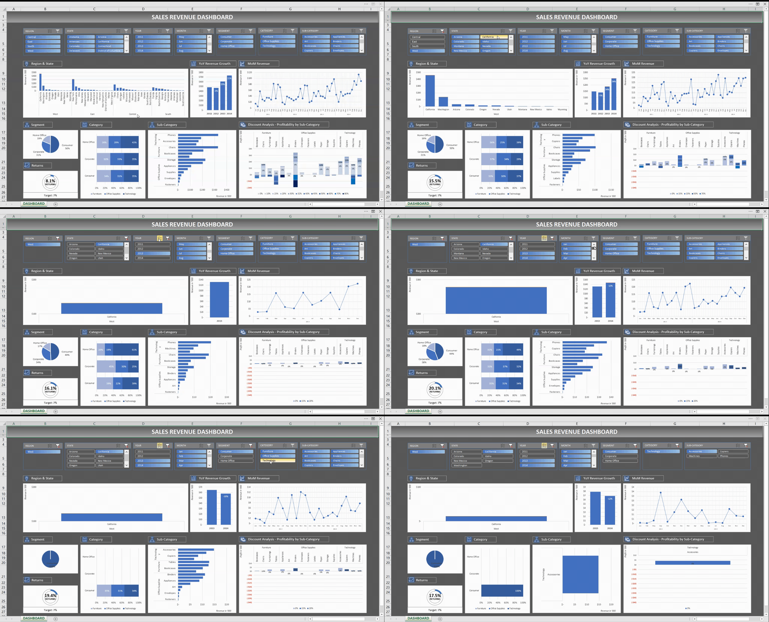
And here is the final product - Click here to download my Excel Interactive Dashboard.
I presented this to the boss, from a standpoint of training him how to use it.
The boss is happy.
I aced the project.
I am happy.
Project Scoring Rubrics
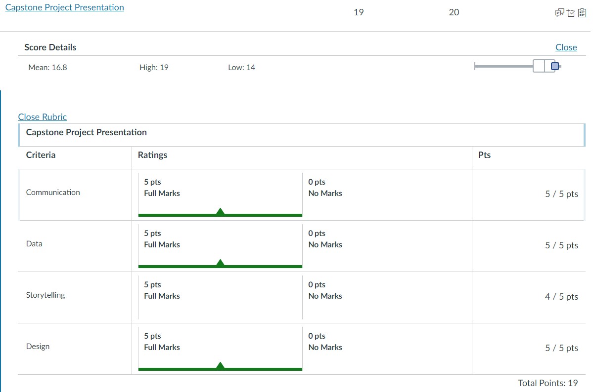
We were rated on the areas of:
- Communication (5 points)
- Data (5 points)
- Storytelling (5 points)
- Design (5 points)
My score was a 19/20.
Contact Me
| https://www.linkedin.com/in/megan-ng-7708a74/ | |
| megan_ng@hotmail.com |
Hosted on GitHub Pages — Theme by orderedlist

