A Data Analytics Enthusiast

Simplifying the world,
One dataset at a time.
I'm fuelled by using data to simplify complexities into actionable insights!
MY PROJECTS PORTFOLIO
MY ARTICLES
ABOUT ME
View My LinkedIn Profile
Building an Interactive Dashboard using PowerBI
Module Introduction
Similar to the Excel course, the Power BI course was designed to be intensively hands-on (LOVE!). We started off with an updated refresher of how the world has evolved to an information age with an explosion of data volume, the underlying drivers of growth of data science and analytics, how analytics capabilities have evolved and matured, and why visualizations and storytelling are the one of the important keys to everyone’s (well, almost 😉) minds. Then immersing ourselves with hands-on learning in Power BI.
Power BI is an application which allows users to get started quickly by unifying data from many sources (cloud and on-premises), using natural language query to build custom visualizations to form real-time dashboards and interactive reports.
This Capstone Project was designed to jog our cognitive process, reinforce and apply our knowledge to “real-life” cases so as to solidify our learnings. We were graded on our ability to showcase and exhibit the five stages of the data lifecycle through the use of Power BI (data collection, creating tables and loading data into Power BI databases, data preparation, data analysis using Power BI, creating visualizations and interactive dashboards, communication of the case study to stakeholders).
Capstone Project 3: Global Superstore (Retail)
Click here to download my PowerPoint Presentation Show
Click here to download my PowerBI Dashboard
Abstract
“A picture is worth a thousand words.” - Henrik Ibsen
Likewise for data, good visualizations increase the willingness to read, makes it easier for readers to recognise patterns and find exceptions while interpreting the data at a faster pace to intuitively understand the story of the dataset, and derive inspirations for action.
This project is based off the context that my boss wants an “app-like experience” in PowerBI, with dashboards which not only enable the overview of business, but also inspires actionable insights, with the ultimate objective of driving sales growth. The dashboard will be used by my boss and the various Head of Sales (whose responsibilities are segregated by region).
Dataset Introduction
The Global Superstore Dataset is a customer-centric dataset, having entries of all orders placed through different locations for the years of 2011 to 2015. It contains around 50000 values.
It contains retail metrics such as order_id, order_date, customer_name, segment, category, sub-category, profit, sales, quantity, packaging days, and the like.
Problem Statement
The Dashboard is designed towards the angle of the Global Superstore owner and various Head of Sales people. Perspectives of segment, product category, and order dates have also been built into the dashboard to enable deeper insights.
It serves to answer questions such as:
- Which regions are the top/bottom performers in terms of Net Profits, Net Sales, Net Quantity, number of customers, orders, average discount, return rates.
- What is the trend of sales over the years?
- What is the category mix of sales?
- Which are the top performing products within the categories in terms of quantity, sales, average discount, average retail dollar?
- Who are the top customers?
- Who are the deliquent customers?
- What should we do to improve?
Process Workflow
My starting point would always be to put myself in the shoes of my target audience (in this case, it’s the owner of the Global Superstore and the various Head of Sales) to grasp a solid understanding of the task objective, brainstorm about the questions they need answered, then how I can exploit the dataset to meet the objective(s).
Retail is a very dynamic business which doesn’t stop, and it is important to design the dashboards to provide immediate insights of the overall business position (standing) with actionable angles of the where, when, what, who, why, and hows. I have designed my dashboards following these angles so as to enable cognitive ease and efficiency for the target audience.
Any experienced Power BI user would know that the foundation of Power BI lies in the relationship of the tables (in the model), and that was one of the essential steps that I took - to ensure that built tables are 100% sound and robust. You can see my model’s table relationships in the image below:
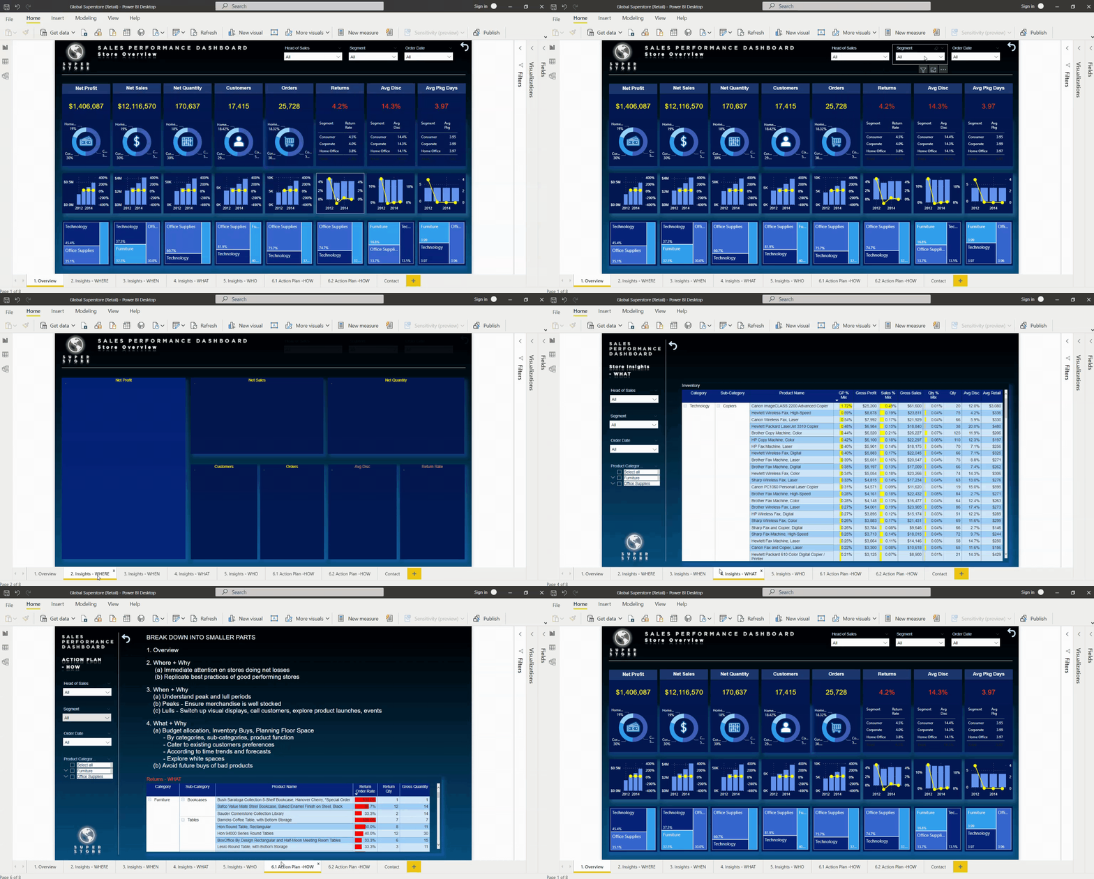
Next, I focused on designing the OVERVIEW dashboard, bearing in mind my stakeholders’ preferred metrics of performance. I bridged these preferred metrics together with additional metrics which I felt would benefit them and this is the final product of the OVERVIEW dashboard:
The OVERVIEW can be dynamically tweaked to suit the perspective of each Head of Sales’ region, and/or Segment, with the order dates of interest - simply by choosing the options from the slicers located at the top of the dashboard.
Since responsibilites are split according to regions, my next dashboard was designed from the angle of WHERE. As like the overview, it can be dynamically tweaked to suit the perspective of each Head of Sales’ region, and/or Segment, with the order dates of interest - simply by choosing the options from the slicers located at the top of the dashboard.
After knowing which regions to focus on, the next dashboard answers the WHEN. Again, it can be dynamically tweaked to suit the perspective of each Head of Sales’ region, and/or Segment, with the order dates of interest, and the added option of product category - simply by choosing the options from the slicers located at the left. Users can also drill into the details by quarters, months, and days, if they like - simply by adjusting the hierachy levels at the top of the visual.
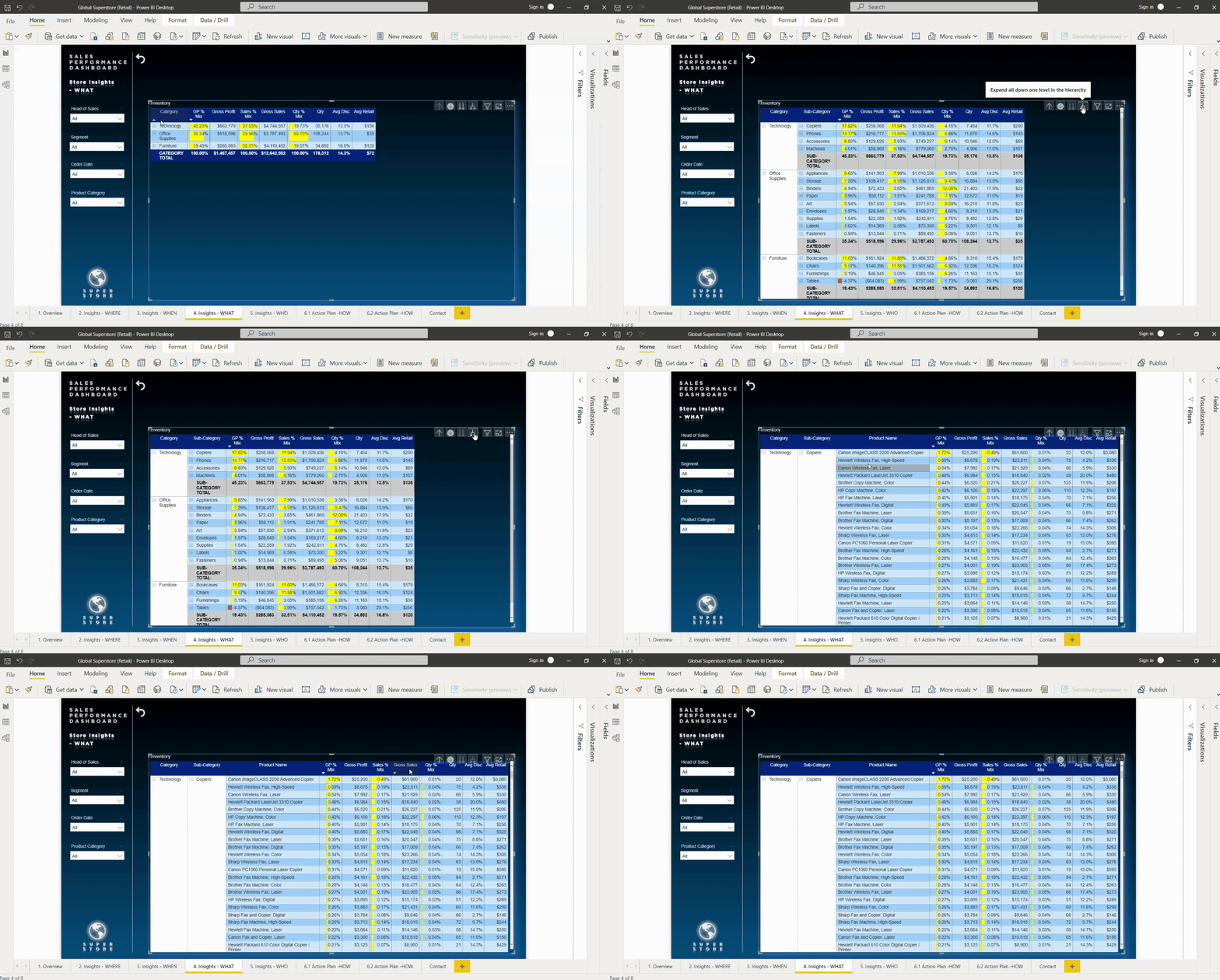
The next dashboard answers questions of the WHAT - whereby users can, at a glance, see each categories’ corresponding gross profit % mix, gross profit, sales % mix, gross sales, quantity % mix, quantity, average discount, and average retail. Users can also drill further into the sub-categories and product names - simply by clicking on the fork (located at the top of the visual).
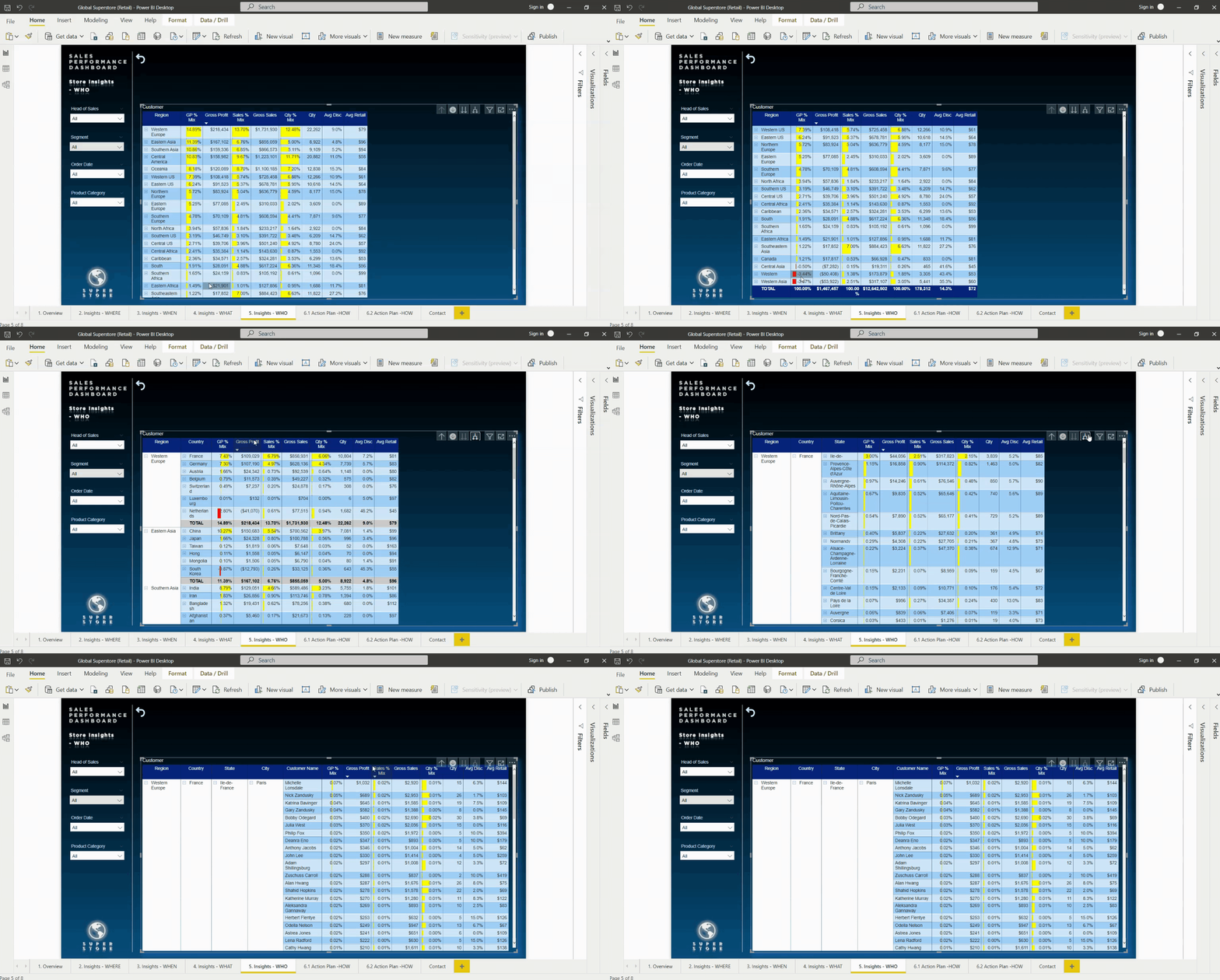
Next dashboard dwells into the WHO - the customers. Users can view which customers are the top (and bottom) by gross profit % mix, gross profit, sales % mix, gross sales, quantity % mix, quantity, average discount, and average retail.
The last 2 dashboards are somewhat like guides as to HOW to make the best use out of the forementioned dashboards (of overview, where, when, what, who) by raising attention to the WHY. The dashboards are designed to be self-explanatory, as follows:
Results
And here is the final product - Click here to download my Power BI Dashboard
I presented this to the Boss and various Heads of Sales, from a standpoint of training them how to use it.
Scoring rubrics contain components of:
- Report (5 points)
- Data Wrangling (5 points)
- Storytelling (5 points)
- Communication (5 points)
I scored a 19 out of 20.
The Boss is happy.
The Heads of Sales are happy.
I aced the project.
I am happy.
Contact Me
| https://www.linkedin.com/in/megan-ng-7708a74/ | |
| megan_ng@hotmail.com |
Hosted on GitHub Pages — Theme by orderedlist


